
Turning Engagement Into Insights
The Analytics Dashboard provides real-time data about how users interact with your AI Assistant, helping you understand user engagement patterns and optimize the learning experience. With features like Key Topics analysis, you can transform invisible user-AI interactions into valuable teaching data. These insights allow for data-driven decision making and continuous improvement of your teaching approach.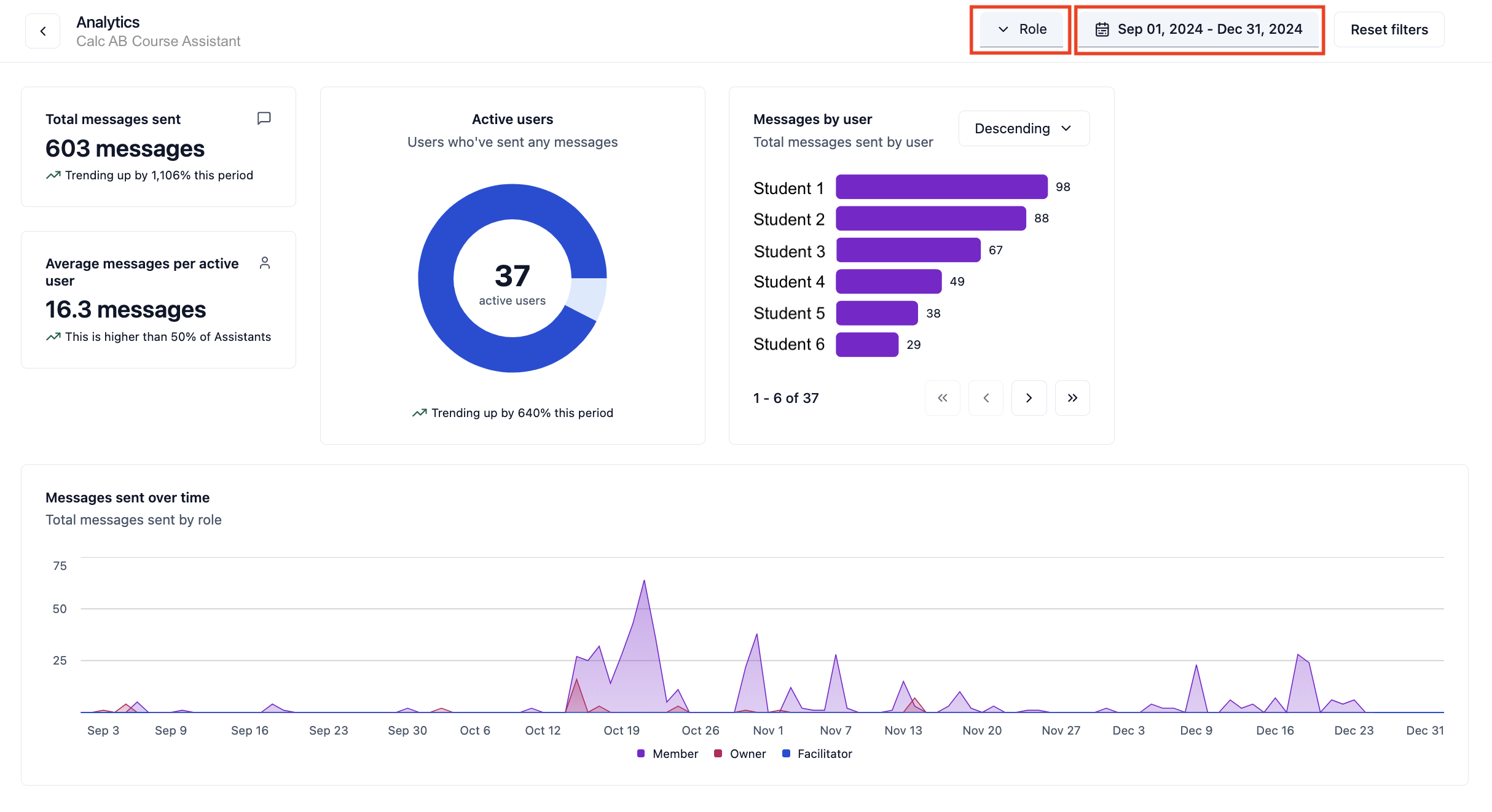
Key Metrics & Insights
- Total Messages Sent: Track the total number of messages sent. This metric helps you understand the level of engagement and communication among members, facilitators, and owners.
- Average Messages per User: See how many messages each active user sends on average, compared with other Assistants in the Workspace.
- Active Users: Identify the number of users actively sending messages. This insight allows you to gauge member involvement and identify those who may need more support.
- Messages by User: Review the number of messages sent by each user. This feature helps you recognize active participants and those who might need encouragement to engage more.
- Messages Sent Over Time: Analyze trends in communication over specific time periods. This visualization aids in understanding peak interaction times and planning your teaching activities accordingly.
Key Topics: Uncover User Conversations
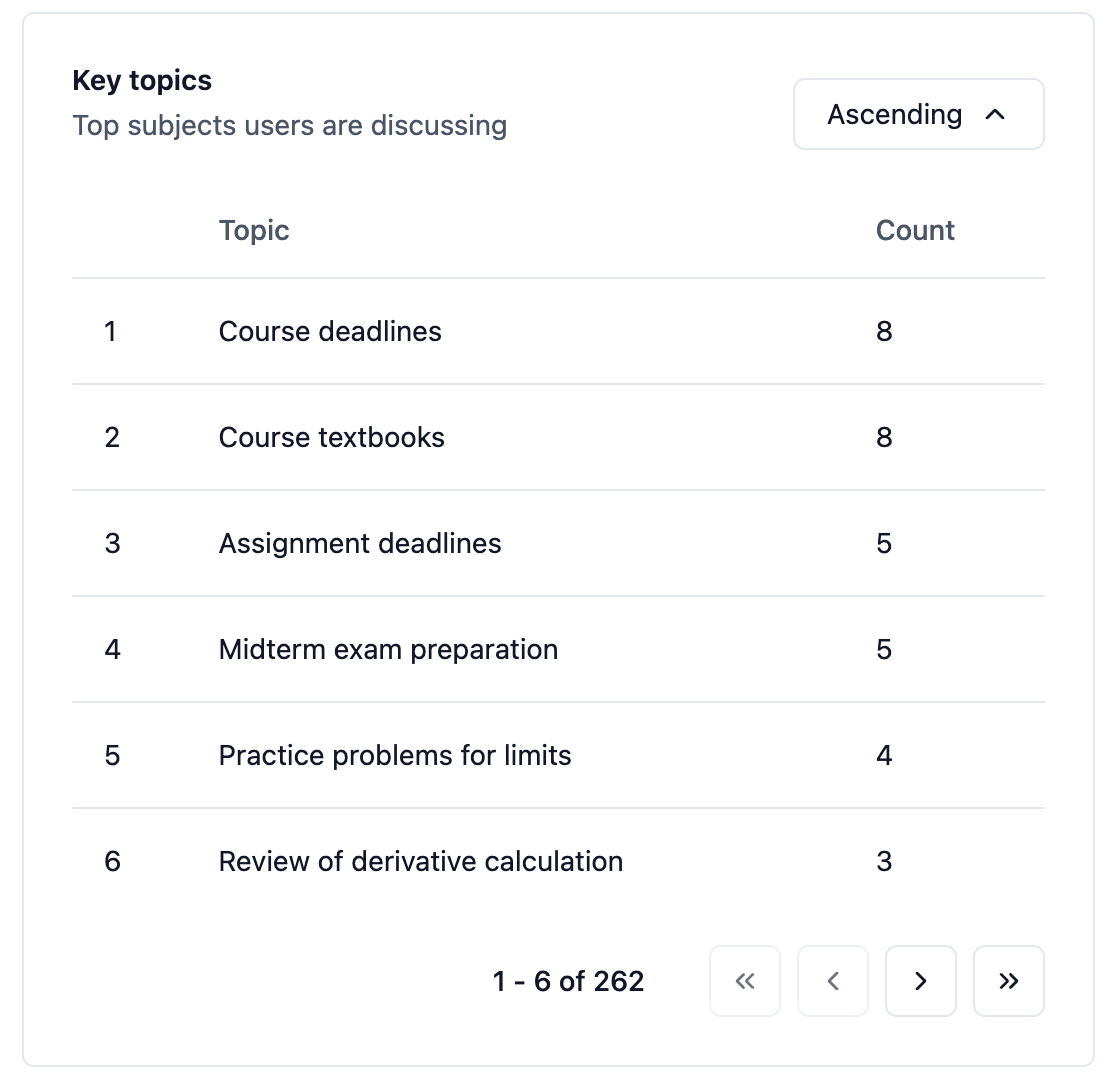
- Trending Topics: See the most frequently discussed subjects in conversations with your AI Assistant, sorted by popularity. Identify what concepts users are most interested in or struggling with.
- Conversation Count: Track the number of conversations for each topic to understand the volume of discussions around particular subjects. This helps identify which areas may need more classroom coverage.
Accessing the Dashboard
1
Select Your Assistant
Navigate to the Assistant you wish to analyze by clicking on it from your
sidebar
2
Open the Analytics Dashboard
Click on the Analytics button at the top right corner to access the
comprehensive analytics dashboard
3
Apply Filters
Utilize the filtering options to refine your data view:
- Date Range: Choose Last 7 days, Last 30 days, Last 3 months, Last year, All time, or a custom date range
- Role: Filter by Group role (Member, Facilitator, Owner) for Assistants in a Private Group, or by Workspace role (Member, Editor, Owner) otherwise
Using the Analytics Dashboard
The Analytics Dashboard offers interactive features to help you explore and understand your Assistant’s usage data:Filtering Data
You can filter the analytics data to focus on specific time periods or user roles:- Date Range: Choose Last 7 days, Last 30 days, Last 3 months, Last year, All time, or a custom date range to analyze trends over time.
- Role: Filter by role to see engagement and activity for different types of users. Assistants in a Private Group use Group roles (Member, Facilitator, Owner); other Assistants use Workspace roles (Member, Editor, Owner).
Exporting Conversation Data
You can export the conversation activity that powers the analytics dashboard for the selected date range and roles:- Click the Export button at the top right of the dashboard.
- Click Download to get a CSV file for further analysis in spreadsheet tools like Excel or Google Sheets. The file has one row per message with user IDs, roles, timestamps, and each conversation’s Key Topics, but no names, emails, or message content. Nectir enables identifiable exports for a Workspace only for approved research cases; in those Workspaces, Workspace Owners can choose Include User Details under Detail Level to add user names, emails, and message content.
Making Data-Driven Decisions
- Track engagement levels: Check the total messages sent and active users to ensure members are engaging with the course material.
- Identify Key Contributors: Use the messages by user feature to identify members who are actively contributing.
- Spot Trends and Patterns: Analyze the messages sent over time to identify patterns in user behavior.
- Personalize Feedback: Leverage insights from the dashboard to provide personalized feedback to members.
- Refine Teaching Strategies: Use the data to refine your teaching strategies for better engagement.
- Identify Knowledge Gaps: Use the Key Topics feature to identify concepts members are discussing most frequently.
- Optimize Course Materials: Review trending topics to understand which course materials may need enhancement.
- Track Interest Evolution: Track how Key Topics change over time to understand the evolution of user interests.